The New NBA Cup Colored Courts Have Been Released And They Are Not As Much Of a Disaster As Last Year
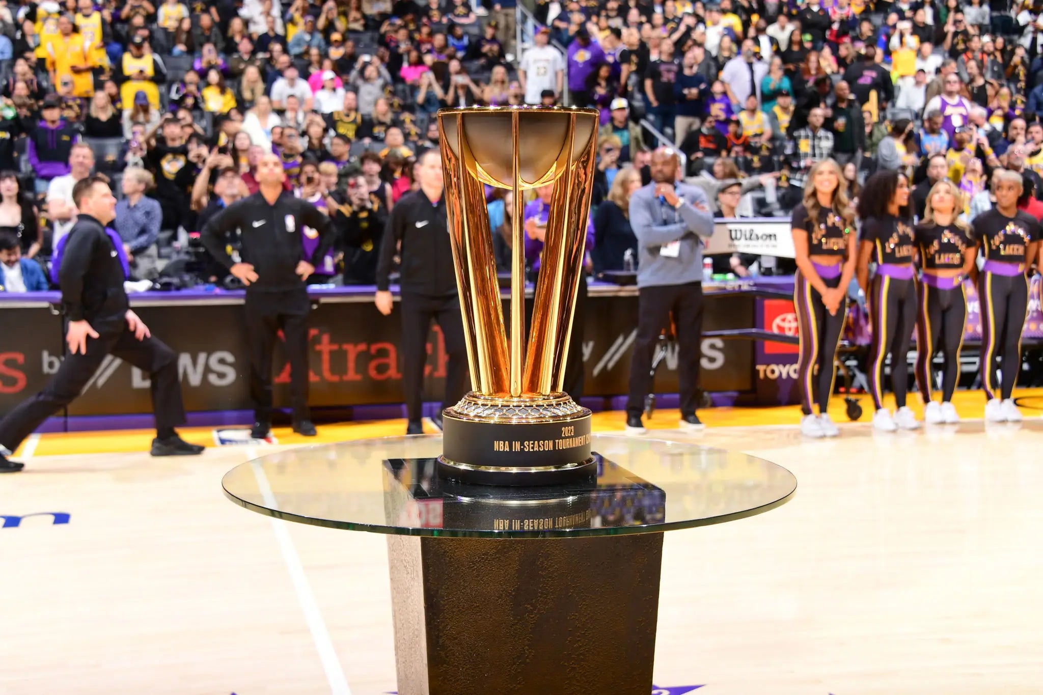 Adam Pantozzi. Getty Images.
Whether you like it or not, the NBA is committed to making the NBA Cup a "thing". When this was first announced a few years ago I was intrigued by the idea, even though I'm not exactly the NBA's target audience for this tournament because I'm already watching every game every night and don't need any extra reason to care about a random regular season game in November or December.
Having said that, there are always potential new fans out there and some people who live actual normal lives that don't revolve around basketball, so I get it. Plus, money. You always have to remember the money aspect.
When we got our first look at the new full colored courts, the reactions were pretty much what you expect. Most people hated on it immediately because people hate change and new things, but admittedly some were better than others. The games themselves were competitive so in that aspect the idea seemed to be working, but that doesn't mean the perception around the tournament has changed just yet. For example, do we think any team or fanbase this year set a goal to win the NBA Cup? Unfortunately, it's not a Larry, and as long as the Larry exists, teams and fans are always going to prioritize that trophy.
Maybe that changes over time and this catches on like international soccer (which is Adam Silver's hope), but it does feel like we're a long ways away from that actually happening.
The good news is as we enter Year 2 of this thing, at least the new versions of the colored courts look a whole lot better
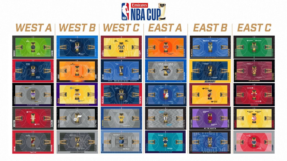
If you're someone who hated the new courts last year, I imagine nothing is ever going to change your mind, which is fine. But knowing that this thing is never going away, I'm all for trying everything you can do to improve the look, and this years design works so much better in my opinion. That giant strip down the middle of the courts last year was so bizarre, and at least this is more cohesive.
I don't exactly love the Pistons putting all that copy on their floor, but other than that I'm not seeing too many misses. In fact, some of these are pretty damn good
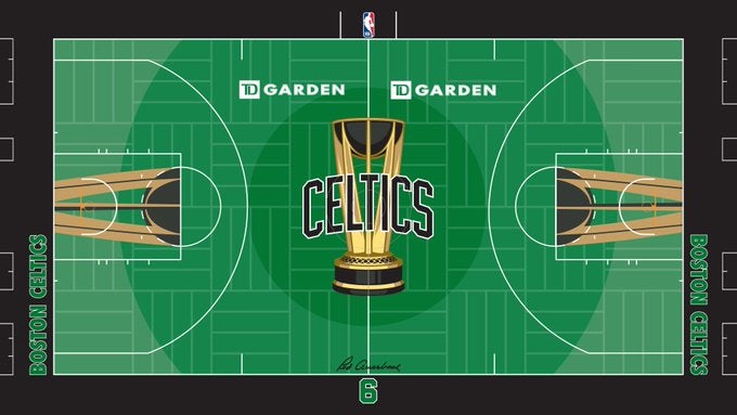
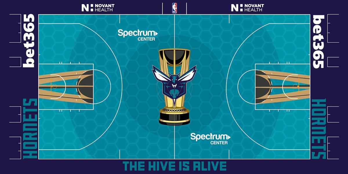
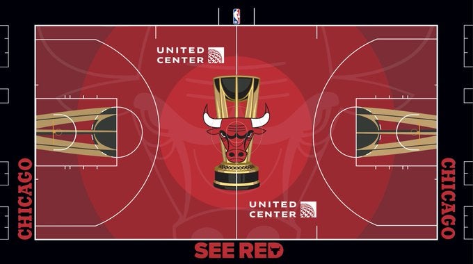
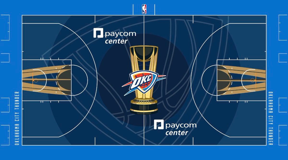
Personally, I am much more pleased with the updated Celts court compared to the disaster we saw last year. The dark green wa a miss, Adam Silver refusing to allow them to have the parquet in the strip down the middle was perhaps the most disrespectful thing he's ever done as commissioner, so I'd say their new court is a massive upgrade.
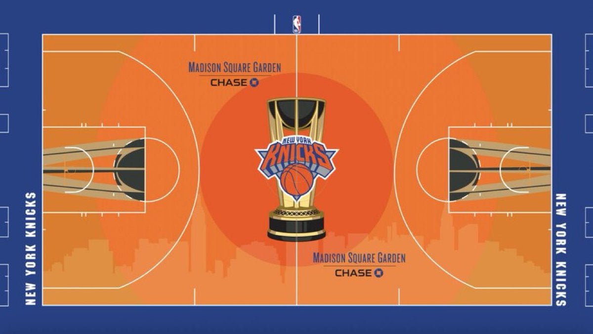
I like the touch of adding the NYC skyline on the Knicks court, something you also see in the Mavs one which I think plays as well. The Hornets color scheme/honeycomb plays, and given what we saw last night in HOU maybe that team is going to be actually watchable? The Bulls kept their all red, but I do like the addition of the logo, which is similar to what we also see with the Thunder. It's also nice to see IND/PHI get back to their more traditional color schemes (Sixers is MUCH better), the TOR purple will always play, and really outside of DET and the MIN one (that green is a miss to me), this feels like an overall improvement.
While there will always be pushback on this tournament and these courts, I will say this. I haven't hated playing on them in 2K25, in fact, I sort of like the change. Given that's the basis for evaluating everything in the NBA, if it works in 2K then I'm willing to be open to it in real life. I'm not going to pretend the players care more about this than any other regular season game or that winning the NBA Cup is even in the same galaxy as any postseason trophy (Conference Finals or Finals), but I am interested in seeing how it continues to develop over the years.
Figuring out the court idea is Step 1, and this time around the NBA did a much better job.


